
Selecting the right metrics to show to upper management is key for promoting departmental interests and relaying vital information about the health of the SharePoint portal or other Microsoft 365 platforms. Selecting the right metrics, with the right aesthetics can be challenging when working with basic out-of-the-box SharePoint /Microsoft 365 reporting. To get your point across with intelligent metrics, you’ll need a more sophisticated solution that provides all these items in simple and effective dashboards.
CardioLog Analytics SaaS transforms the way organizations gather and visualize their data. Integrated seamlessly with Power BI and hosted on Microsoft Azure servers, it takes full advantage of Microsoft capabilities to deliver a state-of-the-art portal analytics solution. It is no ordinary reporting solution; it’s a solution that gives power back into the hands of the enterprise and its users. Designed specifically for SharePoint, Microsoft 365 and Teams, its deep integration allows for advanced reports that reveal rich insights by combining JavaScript user behavior tracking with advanced data from APIs. The report authoring experience is simply unmatched with the extended capabilities of Power BI, and CardioLog Analytics’ out-of-the-box reports for Office 365 / SharePoint Online accompany to help solve the top challenges that organizations face when using SharePoint. It also enhances enterprise workflow by its availability as a service on Microsoft Azure.
The Straight Forward Dashboard You Need – Usage Overview
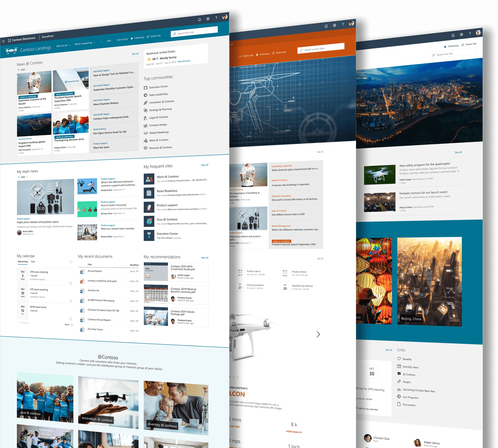
Utilize a Usage Overview dashboard to understand your general content, adoption and search statuses at a farm level, as well as for individual pages, documents, lists, community sites, blogs, and more. This is a great dashboard for getting an overview of what these three major portal categories look like, as well as how they interact and affect each other. You can even measure multiple SharePoint environments, such as SharePoint Online and SharePoint 2019.
Related Topics:
- Why Do Organizations Need Office 365 Reports
- Why & How To Boost Office 365 Adoption
- Office 365 Adoption Content Pack Pros and Cons
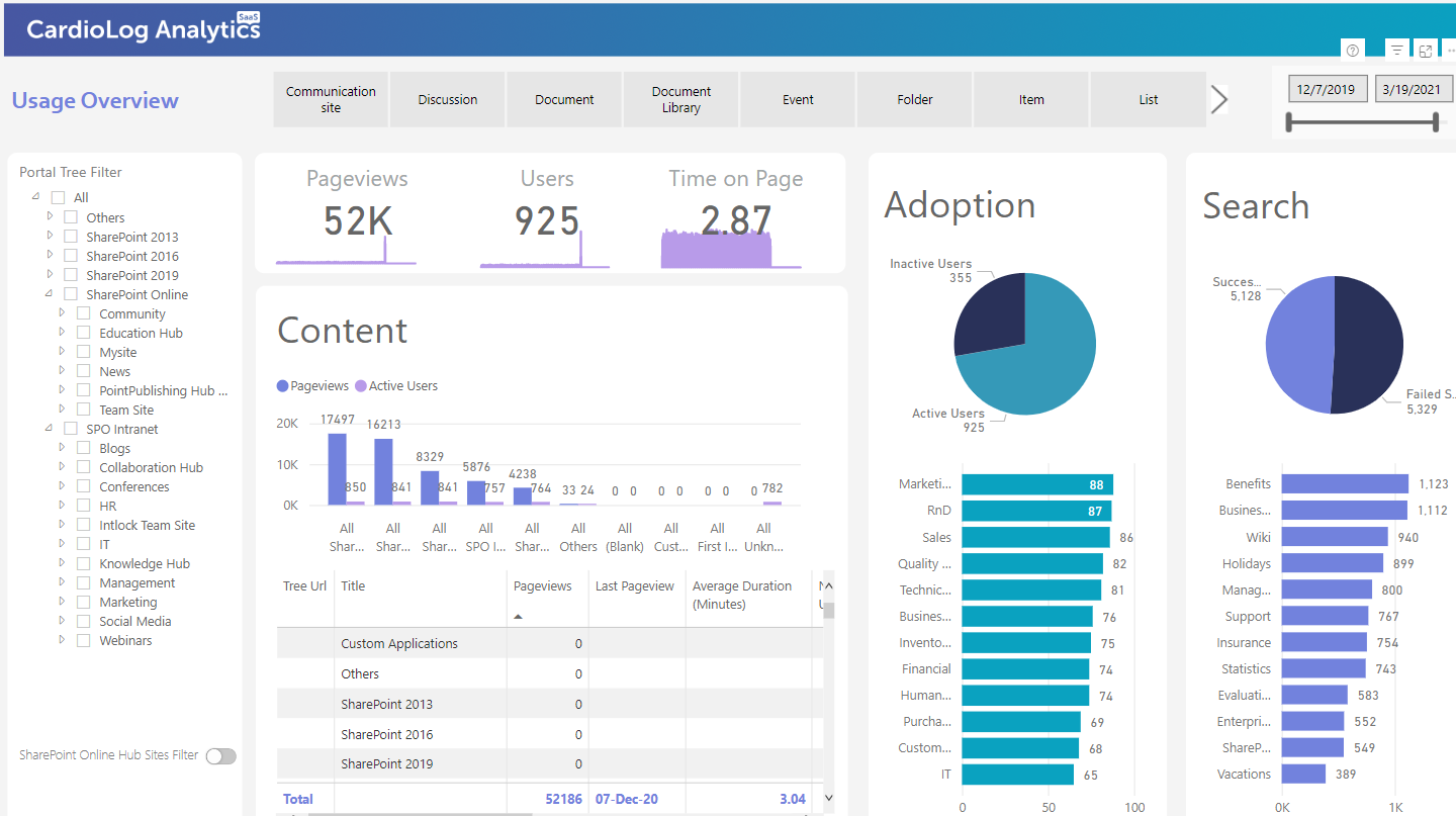
CardioLog Analytics’ Usage Overview Report
Microsoft 365 Reports Metrics
This report was designed with the basics in mind, but also with the ability to drill down and investigate into one of the three most important pillars of SharePoint usage. We’ve divided these pillars into three categories: Content, Adoption and Search.

Content
CardioLog Analytics SaaS has a deep integration with SharePoint / Microsoft 365 content and site structure, providing rich, accurate reports on a wide range of metrics – ranging from most popular content types to number of pageviews and even detecting the days and hours when a site is busiest. By drilling down into the Most Popular Content widget, you can view the most popular items across the entire SharePoint environment. You can select a filter as well, and filter by blog, discussion, document, list, site, folder and more. By viewing the unused or orphaned content, you can begin to understand the value in it . From this point, you can take a number of actions based on this data. If the data is not of value to you, you can simply delete it. If the data is of importance but isn’t being viewed or utilized as much as you’d like, you can update it and then link it to the homepage or site to make it more visible and ensure accessibility to others.
Users can also see additional information from the content widget, with information like who owns the content as well as its size. One of the biggest challenges organizations face when trying to manage their portal is portal sprawl. There may be a wealth of information across the portal, yet it may be disorganized, out of date, duplicated or simply irrelevant. To alleviate these painpoints, organizations can leverage this report to see content pieces that are very large, yet has no page views at all. An administrator can simply use this report by contacting the owner of the content and letting them know that the piece will be deleted within a certain period of time.
The idea is simple: Taking action based on the data provided is made easy by understanding where the largest content with zero page views are.
Adoption
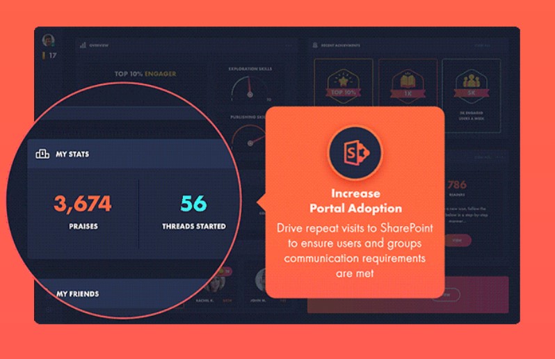
Understanding your SharePoint portal’s adoption levels is to making an assessment of where your portal adoption status lies and how you can map out an action plan for improvement. In the CardioLog Analytics SaaS Usage Report, both sharepoint user groups and profile attributes can be visualized at the macro and mico levels. Understanding which departments have lagging SharePoint usage is made clear with this report, which also allows for drilling down into specific departments to see the most and least active users within each department.
By understanding the basic adoptin levels of groups and users within these groups, senior management can make important decisions about which departments need more SharePoint training to better allocate resources and budgets. They can even use these data driven insights to focus in on specific groups. Perhaps a “group” may look like it’s lagging as a whole, but there may be some advanced users in it. Instead of allocating training to all the users in that group, organizations can make smarter decisions by only training those who really need it, with the analytics to back it up.
Search
When trying to understand how users are navigating through the portal, and what their needs are, organizations can turn to search reports for quick, reliable answers. The search piece of this report completes the puzzle and gives organizations valuable insights into their users’ SharePoint psyches.
By selecting failed searches, it’s simple to find out which of these terms users are having the most challenges with. A failed search is a search action that retrieved 0 results . If holidays calendar was searched for and all the results retrieved weren’t relevant, this means that the user probably went to search again, wasting a good amount of their time because they couldn’t find what they’re looking for. Once organizations know what their users are searching for, they can surface that content and save their users a lot of time. It may also be necessary to look more in-depth into the search schema or queries in order to improve them as well.
This straightforward usage dashboard can help organizations visualize their data through clear and precise metrics. The beauty lies within the connection, the dynamic interactions between content, adoption and search. It’s now possible to thread these reports together, exemplefying the SharePoint portal all in one state-of-the-art report.
To learn more about what you can do with CardioLog Analytics SaaS
→ check out: 4 Reasons Why No one Uses Your Company Intranet – And How Analytics Can Help!


 Follow @cardiolog