

Analyzing and predicting user behavior is a critical part of improving your website performance. This process is called heat mapping. It will help you identify and understand how users interact with various elements in your website. Using this data, you can focus on areas of your website that need the most improvement and optimize the well-performing elements.
In this guide, you will learn in-depth about the features of the best heat mapping tools: Microsoft Clarity vs Google Analytics vs Hotjar.
About Microsoft Clarity
Microsoft Clarity is a tool that was introduced in October 2020. This behavior analytics tool provides in-depth information about user interaction on your website through heat maps. The tool provides crucial information such as dead clicks, rage clicks, user inactivity, and Javascript errors. It also provides reporting on individual sessions so you can further analyze the average website performance and those of individual users.
The good thing about Microsoft Clarity is that it is completely free. The dashboard provides an analytical overview of the report, although it does lack some crucial features such as the ability to do audience segmentation. While a relative newcomer, it is showing promise for anyone looking for a user behavior analytic tool. Microsoft Clarity is also easy to install and use.
Pros of Microsoft Clarity
- Free to use
- GDPR compliant
- Displays images while recording
- Records user inactivity
- Displays Javascript errors
Cons of Microsoft Clarity
- Lacks movement heatmaps
- Lacks audience segmentation
- Lack of user feedback
- Sharing and exporting report is not enabled

About Google Analytics
Google Analytics is one of the many tools offered by Google to analyze your website performance. This tool collects and stores important metrics relating to your visitors, such as page views, bounce rate, conversion rate, and average session duration.
While Google Analytics tracks the crucial data points, it is lacking one crucial element: data visualization. The use of heatmaps for Google Analytics is a major cause for concern, which is why most website owners rely on other tools. To address this concern, Google released the Google Analytics Heat Map tool in 2021. This tool makes it easier to understand and analyze data on your website, especially how users interact with various elements such as where they spend most of their time and what they are clicking on.
The Heat Map tool for Google Analytics is available via a browser extension. When you switch it on, it will provide essential data about your website through color-coding. For example, the most visited area of your website is shown in red while the least viewed areas are shown in blue.
This enables you to create custom reports about your website’s heat map performance using Google Analytics. This custom reporting makes it possible to adjust the data collected to suit your specific needs.
Pros of Google Analytics
- Shows click maps (amount of user clicks on links within a page)
- Provides a variety of metrics to analyze (real-time page visits, average time on page, page views, unique page views, bounce rate, etc.)
- Ability to segment visitors (up to 4 segments)
- Ability to specify the metric you want to track
Cons of Google Analytics
- It only creates click maps
- No tracking on non-clickable elements
- Cannot add observations per recording
- No scroll maps
About Hotjar
Hotjar is a user-friendly tool employed by over 900,000 organizations worldwide. This tool tracks, records, and presents user behavior online for analysis of your website performance. The unique thing about Hotjar is that it presents the data through the “big picture.” It combines Analysis and Feedback tools for evaluating site performance.
Hotjar offers both free and paid plans so you can choose the right tool based on your needs and budget. Naturally, you can do more with the paid plan, but the free version gives you over 1,000 views per heat map, up to 300 recordings, and up to 3 heat maps.
The feedback widget is a unique offering of Hotjar, and uses a rating scale to provide feedback. This tool is recommended for websites that aim to improve sales by analyzing user behavior. It provides an extensive amount of data that you can use to improve your ROI.
Pros of Hotjar
- Comprehensive data on demographics
- Records pauses and mouse trails
- Ability to enable comments for recordings
- Sharing report is enabled
- Relevancy score for each recording session
- Granular data segmenting
- User feedback collection
- GDPR compliant
Cons of Hotjar
- No error report
- No analytical overview on the dashboard
- Lacks A/B testing
Microsoft Clarity vs Google Analytics vs Hotjar: Side-By-Side Comparisons
To help you choose between the three tools for heat mapping your website, it’s best to do a side-by-side comparison. Use the table below to help you pick the right tool based on your website needs.
| Google Analytics | Microsoft Clarity | Hotjar | |
| Do you want to get feedback from users about their site experience? | Yes | No | Yes |
| Do you need support? | Yes | Yes | Yes |
| Do you need your team to access the data and report? | No | No | Yes |
| Do you want to integrate the heat mapping report with your tech stack? | No | No | Yes |
Microsoft Clarity vs Google Analytics vs Hotjar: Which Tool is Best?
Now that you have the essential information about each heat mapping tool, it’s time to make a decision.
Hotjar is the best tool available for companies doing business online. This tool is ideal for those who want to optimize their conversion rate and boost revenue. Hotjar is equipped with the features that will make team collaborations easier so that everyone in your team can collect the necessary data they need to make the appropriate improvements on your website pages. Meanwhile, they have bespoke training available and 24/7 support to ensure that you can maximize user behavior analysis on your website.
Microsoft Clarity is suitable for beginners or those with a smaller amount of data to work with. Since the tool is free, you cannot expect to gain access to the same advanced features as Hotjar. The Clarity dashboard is simplified so that you can easily analyze and understand how people use your website.
Google Analytics is one of the most trusted tools for analyzing website performance. However, its heat mapping features are not as in-depth as the other two tools. You will also have limitations in terms of the data reported; in particular, it only provides detailed insights on clicks within your website.
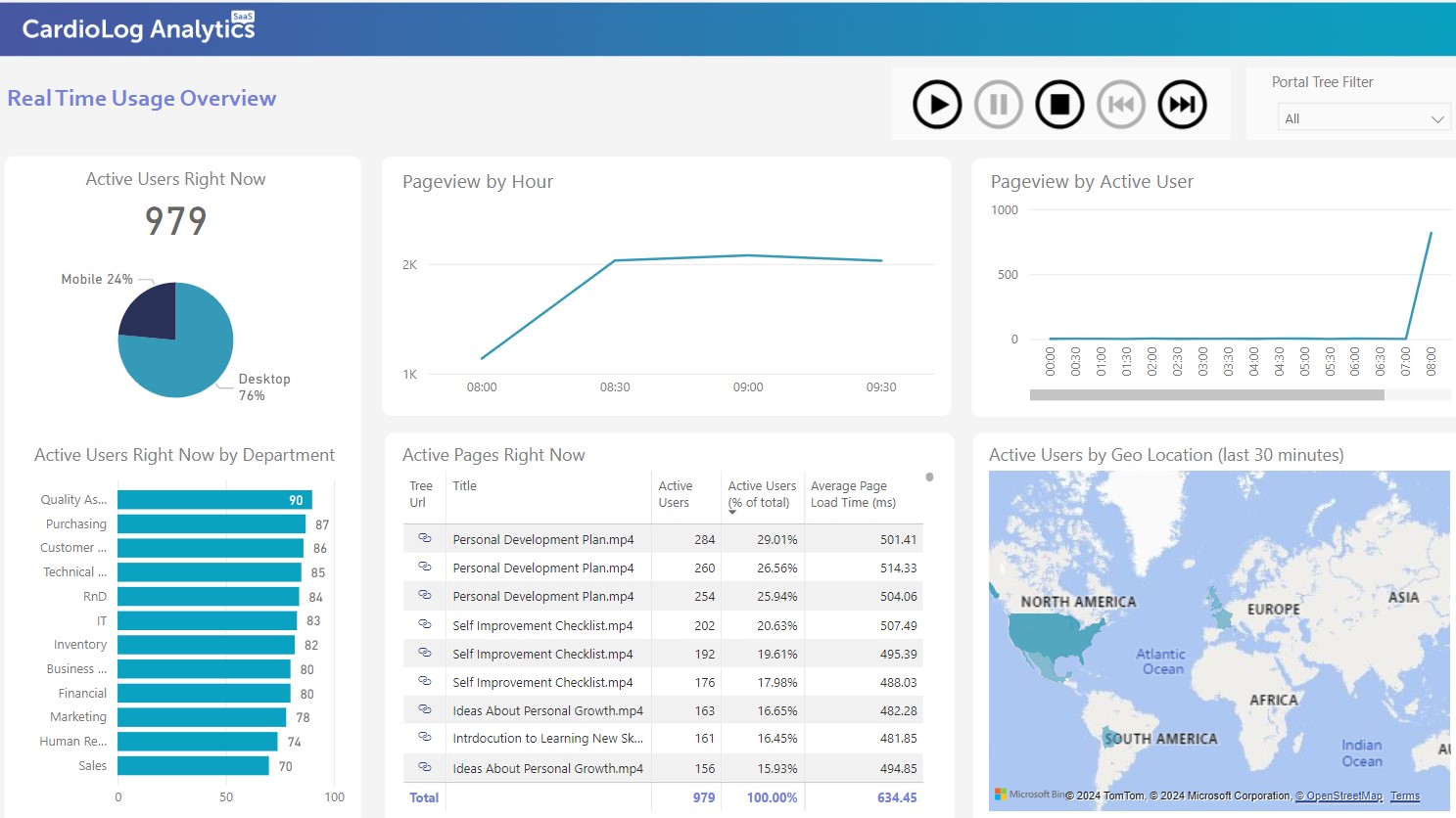
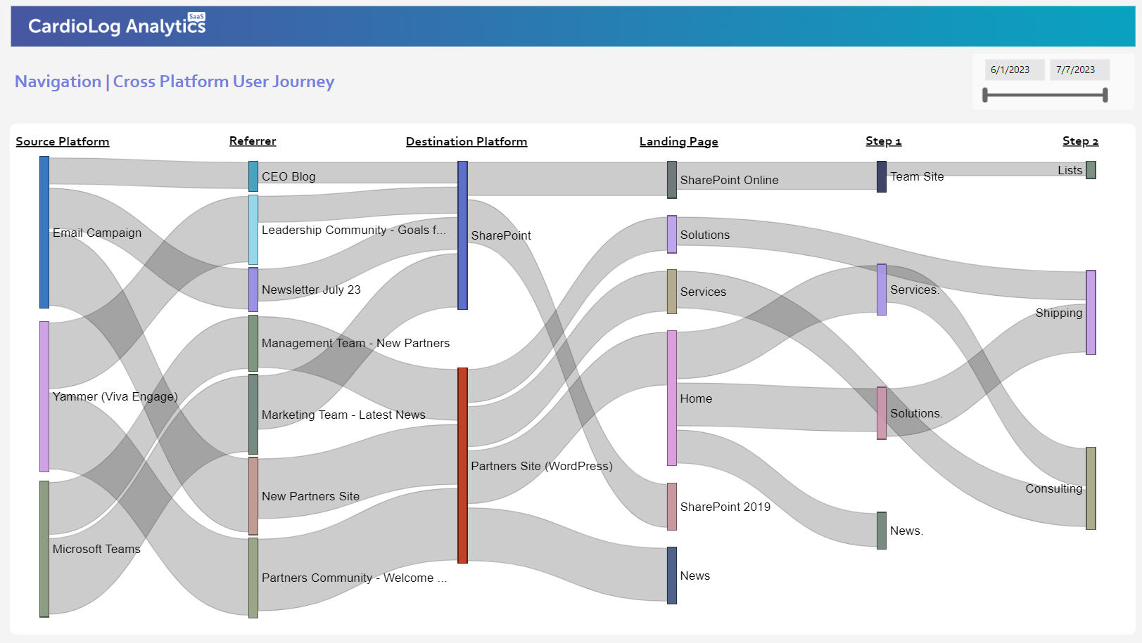
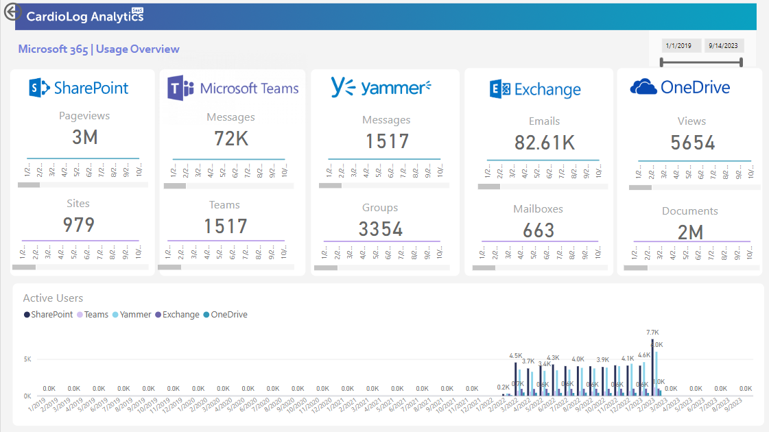
Moreover, integrating Augmented Analytics for SharePoint with NexGen SaaS-based data analytics maps and insights enhances user productivity and drives SharePoint adoption by providing real-time visibility into user behavior, content interactions, and heat mapping analytics, empowering organizations to make data-driven decisions for optimized performance. Visit Intlock to learn more.


 Follow @cardiolog